R4ds-exercises-1
 次阅读
次阅读
文章目录
统计变换
-
What is the default geom associated with
stat_summary()? How could you rewrite the previous plot to use that geom function instead of the stat function?统计变换函数
stat_summary()的默认几何对象函数是什么?如何使用几何对象函数重绘上述图片?geom_pointrange()由于其stat的默认值为identity,需要数据中包含ymin与ymax。但数据中没有,简便起见,我们通过修改stat为summary实现。1 2 3 4 5 6ggplot(data = diamonds) + geom_pointrange( mapping = aes(x = cut, y = depth), stat = "summary" ) ># No summary function supplied, defaulting to `mean_se()结果出图如下
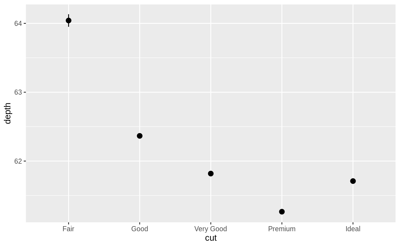
这是由于summary的默认输出使用
mean与sd绘制点线图,所以还需要手动设置fun.ymin,fun.ymax与fun.y的值:1 2 3 4 5 6 7 8ggplot(data = diamonds) + geom_pointrange( mapping = aes(x=cut, y=depth), stat = "summary", fun.ymin = min, fun.ymax = max, fun.y = median )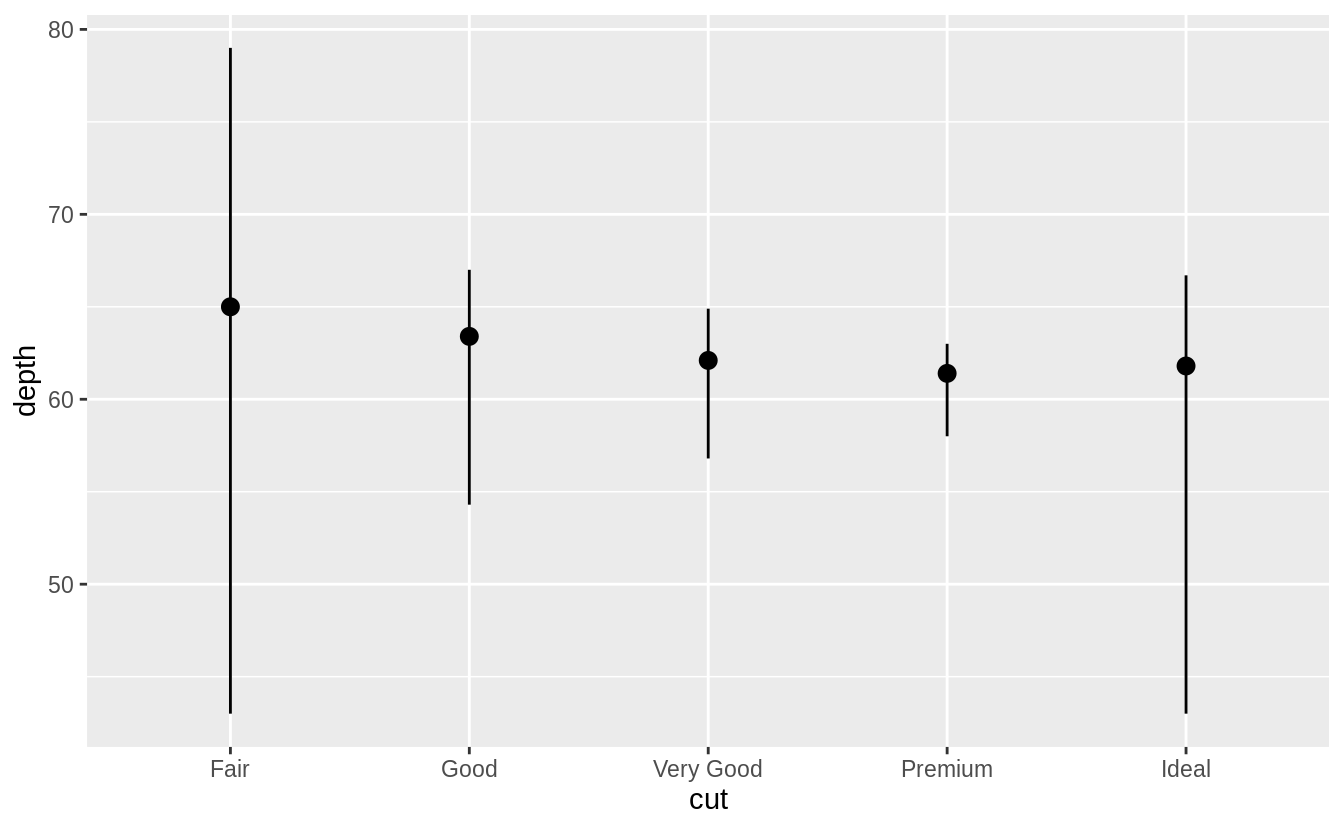
-
What does
geom_col()do? How is it different togeom_bar()?geom_col()函数有什么功能?它与geom_bar()函数的区别是什么?geom_bar()函数使用每个group中的数量来计算条形图的高度。geom_col()默认使用stat_identity()作为统计变换函数,geom_bar()则默认使用stat_count()作为统计变换函数。 -
Most geoms and stats come in pairs that are almost always used in concert. Read through the documentation and make a list of all the pairs. What do they have in common?
大多数的几何对象函数与统计变换函数都是成对出现的。阅读说明文档,给出这些列表,它们有哪些共同之处? ggplot2::geom_abline Reference lines: horizontal, vertical, and diagonal ggplot2::geom_bar Bar charts ggplot2::geom_bin2d Heatmap of 2d bin counts ggplot2::geom_blank Draw nothing ggplot2::geom_boxplot A box and whiskers plot (in the style of Tukey) ggplot2::geom_contour 2d contours of a 3d surface ggplot2::geom_count Count overlapping points ggplot2::geom_density Smoothed density estimates ggplot2::geom_density_2d Contours of a 2d density estimate ggplot2::geom_dotplot Dot plot ggplot2::geom_errorbarh Horizontal error bars ggplot2::geom_hex Hexagonal heatmap of 2d bin counts ggplot2::geom_freqpoly Histograms and frequency polygons ggplot2::geom_jitter Jittered points ggplot2::geom_crossbar Vertical intervals: lines, crossbars & errorbars ggplot2::geom_map Polygons from a reference map ggplot2::geom_path Connect observations ggplot2::geom_point Points ggplot2::geom_polygon Polygons ggplot2::geom_qq_line A quantile-quantile plot ggplot2::geom_quantile Quantile regression ggplot2::geom_ribbon Ribbons and area plots ggplot2::geom_rug Rug plots in the margins ggplot2::geom_segment Line segments and curves ggplot2::geom_smooth Smoothed conditional means ggplot2::geom_spoke Line segments parameterised by location, direction and distance ggplot2::geom_label Text ggplot2::geom_raster Rectangles ggplot2::geom_violin Violin plot
-
What variables does
stat_smooth()compute? What parameters control its behaviour?stat_smooth()函数计算了什么变量?什么参数控制它的行为? |Computed variables| | | —- | —- | | y | predicted value | | ymin | lower pointwise confidence interval around the mean | | ymax | upper pointwise confidence interval around the mean | | se | standard error | -
In our proportion bar chart, we need to set
group = 1. Why? In other words what is the problem with these two graphs?在我们部分的条形图中,需要设置
group = 1, 这是为什么呢?
参考来源
https://r4ds.had.co.nz/data-visualisation.html#exercises-4
https://jrnold.github.io/r4ds-exercise-solutions/data-visualisation.html#statistical-transformations